Although it is already February, I have just started my 2017 goal of learning web design. Since I prefer to learn through doing, I decided to start with my primary side project, Spawning Tool, to develop my skills. On Spawning Tool, StarCraft players can browse replays and guides submitted by other players to find strategies to try out in their own games. I have had a lingering concern about the home page content but couldn’t figure out what needed to change. Since that is the landing page for most visitors, it was a good place to start my design journey.
I asked my coworker Alex, a designer, how to learn web design, and he recommended that I look at other websites and pick out what design elements I like and don’t like. Following his advice, I picked out three sites similar to Spawning Tool in some way and compared their home pages.
The Comparisons
DOTABUFF came to mind immediately as a similar service in a different game. DOTABUFF displays skill and item strategies from Dota 2 games and provides various game statistics.
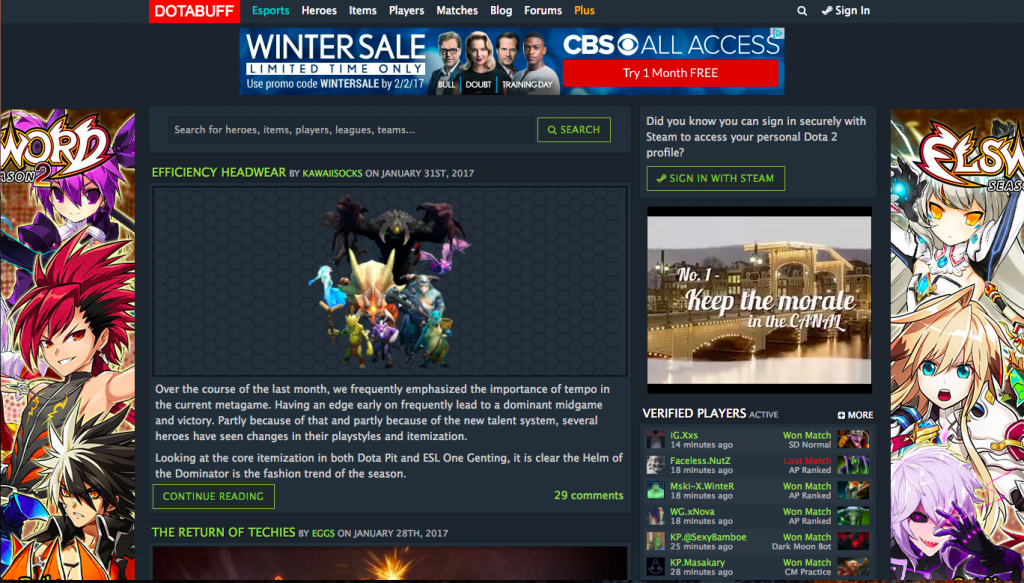
The home page has handwritten blog posts as the primary content in the middle of the screen, and each article with a big picture on it. It lists the generated game content on the right side of the screen. You can access the actual strategies via the header and the search box, which starts in focus.
Outside of gaming, Allrecipes collects community recipes, and cooks can browse different recipes and pick one to follow. It’s basically Spawning Tool for cooking.
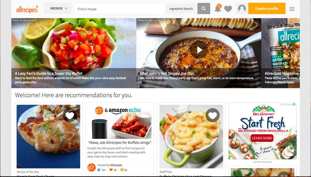
A carousel dominates the home page with links to curated collections of topical recipes. Since the Super Bowl is this weekend, they have recipes for guacamole and other party food. Underneath that carousel, it has a Pinterest-like amalgamation of recipe cards with big pictures. The content continues to load as you scroll to see more pictures. The search input and browse menus are baked into the header at the top of the page.
Sporcle was my last pick. Although it provides quizzes, not guides, it also depends on community-contributed content, which is filtered and browsable by users to select and engage.
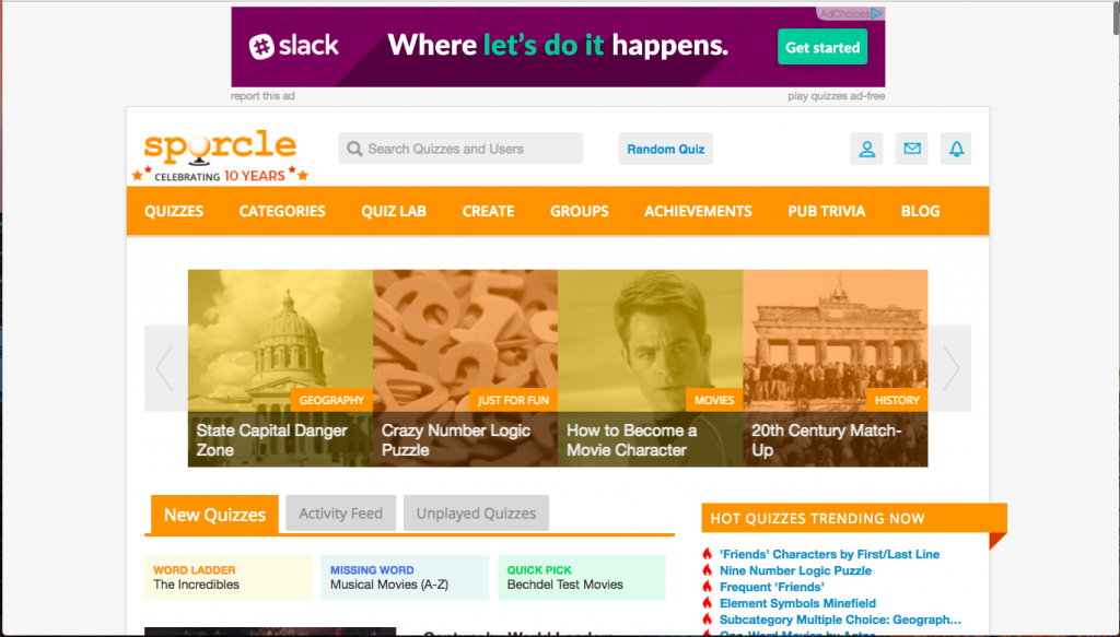
This home page also has a carousel on top, and the quizzes are presumably handpicked by their staff to feature. Beneath that is the list of new and hot quizzes. It also has a banner ad above their site header and navigation, which actually moves other content into the middle of the screen.
The common theme I found across these sites was that they prominently featured curated content on their home page. They all had big pictures and provided search functionality near the top to easily access the rest of the content.
Back to Spawning Tool
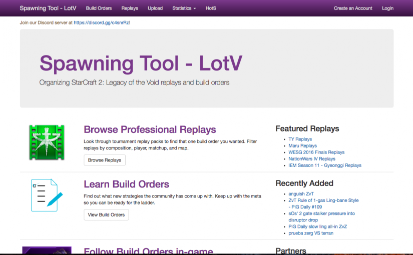
Here is what the Spawning Tool home page looked like before this exercise.
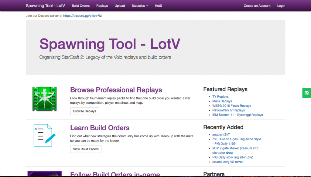
Previously, I couldn’t explain what was wrong with it. However, the problems seem obvious to me now with the context of the other sites.
First, there is a lot of explaining going on. Actually, there isn’t a lot of explaining going on. The explanation elements just take up a lot of space including the white space around them.
Second, the actual site content is relegated to a few links on the side of the page and not featured upfront with any visual or explanatory content associated with it.
Third, there is no search functionality available. To browse the content, you have to click the “Build Orders” link in the the header or find the “View Build Orders” link in the middle of the page. From there, you can actually get to content.
Although it seems seems wrong now, I can see how I arrived at the design as is. My experience in web development has been on business-to-business workflow management platforms. In those applications, there is no community content. The content is all yours, and the site’s value is in providing structure for managing your process. It is hard to directly show that value unless you go through a lengthy setup process, and a casual visitor actually shouldn’t even be able to access client data. On those projects, the public website is just marketing to explain what the application does and try to sell it.
However, Spawning Tool’s value comes from the browsable content itself. It doesn’t require any explanation if you can get directly to the strategies and use it immediately. The explanation is just an obstacle, and the site is really just the quality of the content and ease of use.
That’s roughly how much I have figured out so far. Since I defined these problems, the home page became almost painful to look at, so I actually already made some temporary improvements.
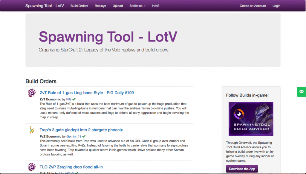
On the front page, I picked out several high quality build orders from community figures and professional players to display. I wanted to move them up to the top, but the visual balance didn’t feel right because the build orders are currently heavy on text. The compromise was to keep the jumbotron, but I want to figure out what other pictures or visual elements I can use instead.
I’m not sure what the rest of the design process is, but I feel like I have only taken a first step. It will take longer to create a more permanent Spawning Tool home page, and I hope that process can be just as insightful as this first step in exploring design.
5 replies on “Discovering My Web Design Mistakes”
I agree with most of your points. Just a personal opinion, the main header/banner can be more… inviting (not sure if it’s the right word).
I agree with that: I left the jumbotron element at the top because I couldn’t come up with something better to put there, at least on this iteration. I’m definitely open to ideas!
Somehow these sites reminds me of WordPress themes. Such as 2016 or News.
Yeah I can see that. With dotabuff, they really are featuring blog content on their front page, so I guess these are relatively modern patterns for supporting something like a CRM
[…] about how those designs came together and explore my artistic side. Earlier this year, I already redesigned at Spawning Tool and foodmarks. My last design project of the year is my last major website: this […]